


Andrew Laurendi is a filmmaking student whose academic and hands-on experience supports a practical understanding of postproduction techniques and visual storytelling. Based in New York and currently pursuing filmmaking studies at the Los Angeles Film School, Andrew Laurendi has completed coursework in editing, audio production, lighting, directing, color correction, cinematography, digital literacy, and screenwriting. He previously earned a film degree from Long Island University Post Campus after studying communications in Garden City, New York. Alongside his academic training, he has completed several independent short films and developed customer service experience through roles at Whole Foods and Stew Leonard’s in Farmingdale. His background also includes leadership responsibilities as a high school class president and volunteer work with HorseAbility in Old Westbury.
A Guide to Color Grading in Filmmaking
Color grading is a postproduction phase that adjusts a film’s visual qualities, such as contrast, color, and brightness, so it looks its best for presentation across different screens and devices. It establishes a motion picture’s visual identity and emotional tone.
As with a film’s script or camera work, filmmakers treat color as a creative tool. This process defines a project’s atmosphere and engages viewers, helping transform standard footage into a cinematic experience that communicates the director’s vision.
The workflow begins by capturing footage in high-quality formats like RAW or LOG, which retain image data. A video editor performs color correction to resolve technical issues such as white balance – adjusting color casts so whites and other colors look true to life. This step creates a natural baseline resembling how the human eye perceives the world.
After achieving a neutral image, the creative grading phase begins to introduce specific moods. This stage involves adding unnatural tints or stylization to support the narrative. Following this specific order ensures that artistic choices rest on a solid technical foundation.
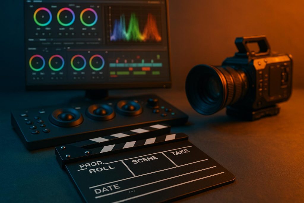
Colorists use specialized software and hardware to work with digital footage with precision. Essential monitoring tools called scopes, such as histograms and waveforms, provide objective data on color balance. These graphs allow professionals to see details the naked eye might miss, preventing lost information in dark or bright areas.
They also use wheels and tone curves to modify brightness ranges to adjust the visuals. Additionally, look-up tables act as templates that aid in applying consistent aesthetics across various shots. An accurate monitor is equally important. This device should support hardware calibration to ensure the result is consistent with what will be seen by the audience.
Filmmakers manipulate audience emotions by adjusting color temperature, saturation, and contrast. Warm orange tones create an inviting feeling and evoke feelings of nostalgia or comfort, while cool blue tones make a scene appear clinical, unsettling, or futuristic. These visual cues help tap into natural human psychology.
Saturation levels also dictate how a viewer experiences the film’s world. While vibrant palettes create energy, desaturated images introduce desolation typical of historical films. Additionally, reducing colors forces the audience to focus on elements like composition, character, and action.
Contrast levels directly correlate with perceived tension. For example, high-contrast images with deep shadows create intensity. This is ideal for thrillers. Conversely, low-contrast palettes create a dream-like feeling that helps diffuse tension, especially for romantic films. Overall, combining these principles allows a colorist to guide the audience through a film’s emotional highs and lows.
Notably, many famous films have utilized distinct color grades to reinforce themes. For instance, teal and orange are common in blockbusters because they are opposite colors that contrast well, making subjects stand out against shadows. Some movies feature monochrome tints. An example is “The Matrix,” which used the green palette to signify an artificial or digital environment. Similarly, the film “Mad Max: Fury Road” used high saturation and vivid imagery to achieve a graphic novel aesthetic. These choices ensure the visual palette aids in storytelling.
Achieving professional results requires a colorist to balance technical skill with creative discipline. This means that, for example, using a high-end motion picture camera will produce richer, more workable footage than a consumer-grade device. They must also understand that elements such as skin tones are not easy to maintain from shot to shot. Therefore, they should refrain from over-editing scenes, as this inconsistency may pull viewers out of the story.
Strong color grading also requires the colorist to collaborate with the director. Reference images help both parties stay aligned on the intended look. Ultimately, the best color grading serves the story quietly, without overshadowing it, ensuring the final film feels cohesive and intentional.
About Andrew Laurendi
Andrew Laurendi is a filmmaking student studying at the Los Angeles Film School after earning a film degree from Long Island University Post Campus. His coursework includes editing, cinematography, audio production, directing, lighting, color correction, and screenwriting. He has completed independent short films and gained customer service experience through positions at Whole Foods and Stew Leonard’s. He also served as class president at Iris Wolfson High School and volunteered with HorseAbility in Old Westbury.

