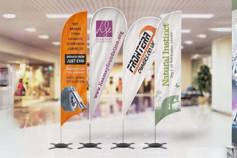
When starting a new business, renewing or rebranding an existing brick-and-mortar site, or hosting a major event, you want all eyes on your brand. Custom flags or banners for businesses never go out of style. You can display a brief message with your company’s name, logo, or colors for as long as you choose.
However, the designs of your custom flags have a sole bearing on how effective they are. Here are the most critical custom flag design pointers to get the most out of your investment.
Identify the correct dimensions.
The dimensions of your custom flags will affect the content’s legibility and visibility. For instance, it is not wise to pick something too large if you intend to display the flags on your storefront to draw clients. The large flags will distract customers and block light from entering your establishment.
On the other hand, you should select personalized flags in huge sizes if you intend to advertise your company at trade exhibitions and events. In this manner, you may swiftly grab attendees’ attention, even at a packed event. Ensure that the custom flags are readable from a distance, regardless of size.
Use good color combinations.
When you use color poorly, your design may be confusing. It will be hard to read your font from a distance if the color blends in with the background colors. Furthermore, using colors that are too strong or vibrant can strain the eyes and detract from the attractiveness of your design.
Take care when choosing color combinations to create a visually appealing and successful design. Use bright backgrounds with dark fonts, or vice versa, to make your writing readable and understandable. You should also use colors from your branding for a polished, consistent appearance that complements the remainder of your company’s visuals. Last but not least, ensure that the colors in your design complement the theme of the occasion where you will place your flag.
Use visible fonts
Making a font selection is a crucial step in creating a unique flag for your company. Refrain from succumbing to the allure of ornate, intricate fonts. These may be eye-catching up close, but they won’t be readable from a distance. Choose fonts that are contemporary or traditional and have clean, straight lines instead. Additionally, avoid mixing fonts. Your design will have a consistent, aesthetically pleasant, and easy-to-read appearance when you choose just one typeface.
Is it two- or one-sided?
Your design is only visible on one side of single-sided flags. It becomes mirrored on the other side as a result. Single-sided flags are a good choice for simpler or more symmetrical designs that are still recognizable to onlookers when inverted. This choice is also practical if most people only view one side of your flag.
A double-sided flag can be a better choice if your design is more intricate or has more text. The artwork is printed on both sides of double-sided flags, allowing you to view the same picture from any viewpoint. This technique works well for intricate designs or flags that onlookers will see from several angles.
The Bottom Line
Design attractive, readable, and practical custom flags to get the most out of your investment.

